Calligraphy handwriting has a poised, architectural feel-think crisp verticals, gentle diagonals, and carefully balanced curves. Each letter stands on its own, with clean edges and thoughtful spacing that makes words easy to read and beautiful to look at. For learners, that clarity reduces overwhelm and lets them focus on one shape at a time. It's a style that rewards patience and steady hand control while still leaving room for personal flair.
Practicing calligraphy strengthens the key building blocks of handwriting, including line control, letter size, spacing, and rhythm. Students learn how much pressure to use, when to lift the pencil, and how to keep strokes even from start to finish. Paying attention to top to bottom spacing also helps letters stay balanced and easy to read. These small skills improve neatness while building the muscle memory needed for smooth, confident writing.
This collection is arranged to meet learners where they are and guide them forward step by step. You'll find sheets that isolate capitals and lowercase, reinforce tricky mid-alphabet letters, and stretch writers into words and full sentences. The designs encourage short, consistent practice sessions that add up to real fluency. Together, these worksheets create a supportive pathway from tracing to proud, independent handwriting.
Looking At Each Worksheet
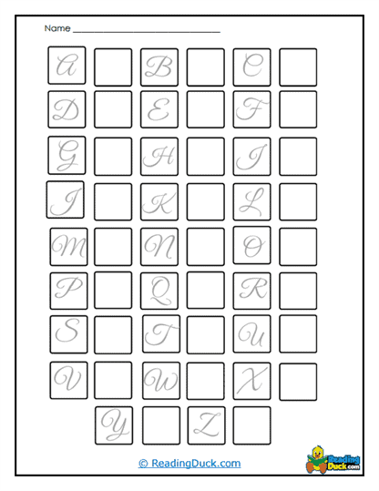
Capital Boxes
Use this sheet to give students a visual boundary for each capital letter so they learn to keep heights consistent and tops flat. The "box" format encourages even verticals, clean diagonals, and tidy corners-great for training steady wrist and finger control. In class, try timed rounds where students trace once, then freewrite twice. At home, a quick daily lap around the alphabet builds stamina without fatigue. Over time, the consistent frame helps internalize proportions so capitals look uniform across every word.
Capital Connections
This worksheet invites learners to position capitals next to neighboring letters, refining spacing and entry/exit strokes. It's perfect for practicing where a word should "open" visually-keeping the capital anchored while the next letter sits at a respectful distance. Teachers can model a tap-count rhythm (tap for the capital, tap for the space) to reinforce pacing. Parents can cue light pencil lifts to avoid smudging and over-pressing. The result is a disciplined yet fluid start to every word, boosting legibility and confidence.
Capital Mastery
Use this page for targeted review of the capitals that still feel wobbly. Rotate in three "focus letters" per session, with a trace line, a guided copy, and a final free line to show growth. This steady cycle helps build muscle memory and reduces hesitation mid-stroke. Encourage students to circle their strongest attempt at the end-celebrating best reps motivates consistent practice. As mastery grows, students carry their precision into titles, headings, and signature lines.
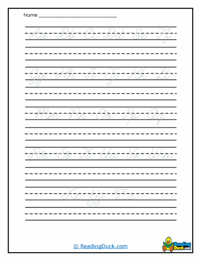
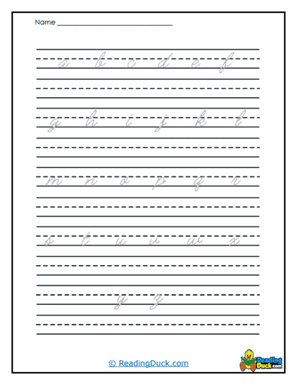
Connected Letters Practice
Although calligraphy letters often stand alone, this sheet gently explores tasteful connections and spacing within words. Learners experiment with micro-joins and rhythm so letters feel like a team, not isolated shapes. In class, pair it with whisper counting (1 for letter, 2 for space) to keep tempo even. At home, try short name-writing drills for practical relevance. The practice improves word flow without sacrificing the crisp, structured look of calligraphy.
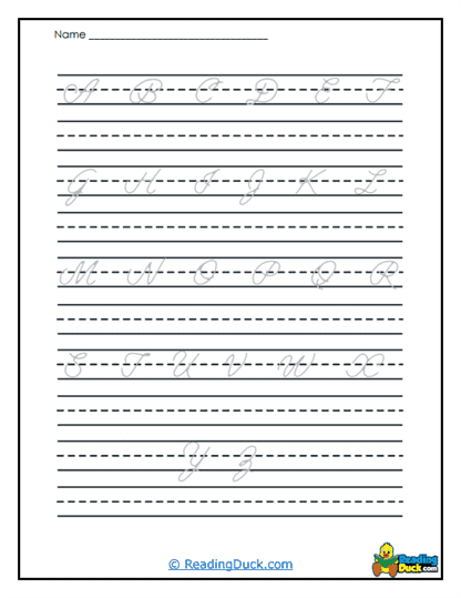
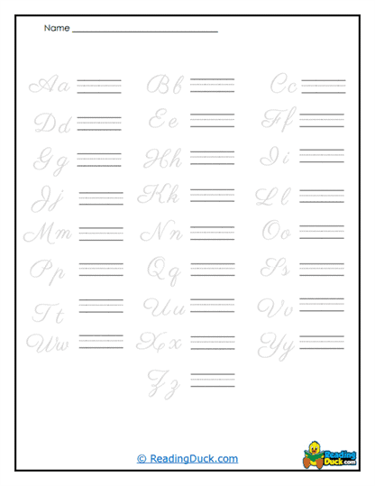
Cursive Capital Basics
This bridge worksheet introduces cursive-style capitals while preserving calligraphy discipline. Students learn entry strokes and graceful overlines that transition cleanly into the next letter. It's a smart way to develop motion planning and reduce pen lifts, which later supports faster note-taking. Keep sessions short and relaxed-focus on smoothness instead of speed. Over time, learners gain a hybrid skill set: elegant capitals with the beginnings of cursive fluency.
Cursive Match-up
Here, students match cursive forms to their calligraphy counterparts, sharpening visual recognition and stroke planning. It's excellent for learners who benefit from side-by-side comparisons before trying new motions. Teachers can lead "spot the difference" discussions to build vocabulary around loops, slants, and terminals. Parents can encourage tracing with light pressure to keep lines clean. The matching format reduces anxiety and makes style shifts feel achievable.
Curvy Lowercase
This page targets rounded letters like a, c, e, and o-shapes that require even pressure and careful closure. The guided lines cue where curves should begin and meet, preventing gaps and flattened arcs. In practice stations, rotate pencils or markers with different tip widths to improve control. At home, two slow laps around each letter are better than one rushed line. Those calm repetitions train circular motion, which carries over to smoother words.
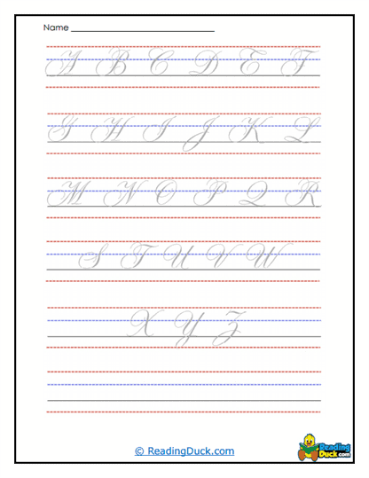
Elegant Capitals
Use this worksheet to refine polish: controlled diagonals, balanced serifs, and stately symmetry. Students learn to pause briefly at corners, then restart with intention-like a dancer changing direction gracefully. Try mirror practice: write the letter once, then copy it as if reflected, to sharpen spatial awareness. Encourage gentle exhale breathing on downstrokes to reduce tension. The result is a dignified capital set that elevates headings, certificates, and cards.
Full Sentence Cursive
This sheet stretches writers into longer, connected phrases, emphasizing endurance and consistent slant. It's ideal for building the hand stamina needed for journaling and classroom writing. Teachers can set a "steady tempo" using a metronome or soft claps to keep movement relaxed. Parents can have students read their sentence aloud after writing to reinforce the sound-symbol link. Over time, students learn to maintain neatness from the first word to the period.
Letter Ending Elegance
Focused on terminals and finish strokes, this worksheet teaches clean exits that don't trail off or spike. Learners practice lifting at the right moment so words stop decisively and look intentional. In class, compare "before" and "after" samples to celebrate visible progress. At home, coach a light "feather lift" at the end of each word to avoid smears. Strong finishes boost readability and give writing a professional, framed look.
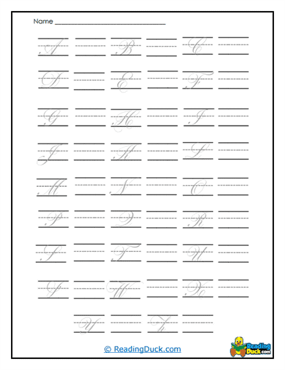
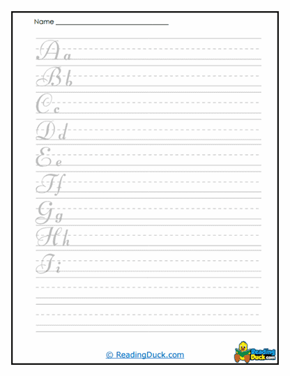
Letter Trace
A classic starter: trace, trace, then try solo. It's excellent for beginners who need scaffolded support to lock in shapes and stroke order. Use short bursts-two or three letters at a time-to keep quality high. Encourage students to check three things after each line: shape, size, and spacing. That quick self-check habit pays off later when they write independently.
Letter Tracing Fun
This playful tracing sheet adds a bit of variety-pattern paths, cheerful prompts, or themed words-to keep practice engaging. Teachers can turn it into a "beat the clock" game while maintaining calm, controlled lines. Parents might swap writing tools (pencil, crayon, gel pen) to strengthen finger dexterity. The fun framing reduces performance pressure and invites more repetitions. More reps mean faster progress toward smooth, confident handwriting.
Lowercase Loops
Loop letters like b, f, g, h, j, k, l, y are the stars here-great for refining vertical control and consistent loop height. The structure prevents top loops from ballooning and bottom loops from shrinking. In class, mark the loop "ceiling" and "basement" with quick highlights so learners visualize boundaries. At home, try slow-motion loops to build control without squeezing the pencil. Mastering loops improves both elegance and readability across everyday writing.
Mid-Alphabet Mastery
This sheet isolates commonly tricky letters in the middle of the alphabet-like m, n, r, s-that often cause rhythm hiccups. Students rehearse the pattern of bumps, humps, and turns until it feels automatic. Use call-and-response cues ("up, over, down") to guide pacing. Encourage light grip and relaxed shoulders to avoid jagged lines. As these mid-letters stabilize, whole words start to look more even and mature.
Square It Up
Aimed at straight-edged shapes (think E, F, H), this worksheet sharpens corners and horizontal alignment. Learners practice crisp stops and tidy restarts so letters don't lean or sag. In class, try a ruler-check: place a ruler along baselines and crossbars to spot alignment wins. At home, a 60-second "straight lines warm-up" primes control before writing. Squared shapes train discipline that benefits every other letter on the page.
Let's Unpack Calligraphy Handwriting?
Calligraphy looks structured and composed-letters sit upright with measured spacing, precise angles, and carefully shaped curves. It has the elegance of a printed poster but the warmth of the writer's hand. The aesthetic is calm and orderly, making text feel trustworthy and polished. Imagine a well-organized bookshelf: everything has a place, and that neatness makes the whole room feel better.
In terms of skill level, calligraphy is very teachable because each letter is practiced in isolation. Beginners appreciate the slower pace and clear targets, while advanced students can push refinement and consistency. It's useful both for everyday clarity (labels, notes, journals) and special pieces like certificates or classroom displays. The practice transfers neatly to other styles, laying a strong foundation for cursive and even decorative lettering.
On speed versus precision, calligraphy leans toward deliberate control-accuracy first, then efficiency. Early on, students write slowly to place lines and corners with intention. With time, rhythm develops and writing gets naturally quicker without getting sloppy. It's like learning scales on a piano: precision comes first, and speed follows as the motions become second nature.
Personalization shines once fundamentals are solid. Learners can tighten or open spacing, add gentle flairs to terminals, or slightly adjust slant to express their voice. In real life, the style pays off in readable notes, beautiful headings, handmade cards, and tidy classroom work. Think of it as the "smart blazer" of handwriting-versatile, polished, and ready for both everyday use and special moments.
Make sure to bookmark our website now.
Enjoy all our free reading worksheets.
Our materials adhere to the principles of the Science of Reading.